Most posts about the "best economic development websites" are vendor showcases in editorial clothing. The agency writes about their own clients, gives everyone gold stars, and calls it a roundup. You've seen them.
This isn't that. I reviewed nine real EDO and talent attraction sites — including two I built myself — using a transparent six-criteria rubric with numerical scores. I used Ahrefs to pull actual organic search data for each site. I read the source code. I noted what works, what doesn't, and what other organizations can actually steal from each one.
The goal is to give economic development marketing directors, CEOs, and communications teams a genuine benchmark: here's what the best-in-class sites look like, here's how they were evaluated, and here's where most EDO websites — including some big-budget ones — are still coming up short.
If you want to score your own site against this rubric, download the free scorecard PDF at the bottom of this post.
Two months on, the finding that's resonated most with the EDO directors who've emailed about this post is the lead-capture gap — eight of nine sites driving traffic they never convert. We've since written up exactly how we build that lead capture, the searchable property database, and the cost-of-living calculator into a site, in our economic development website design guide. The rubric and the scores below are unchanged from the original April review.
The Scoring Rubric
Each site is scored 1–5 across six dimensions, for a maximum of 30 points. Performance scores require running each site through Google PageSpeed Insights (mobile tab) — do those manually to get your baseline.
#1 — Greater Des Moines Partnership
21 / 30dsmpartnership.com · "This is Greater Des Moines" · Built by Blue Compass Interactive
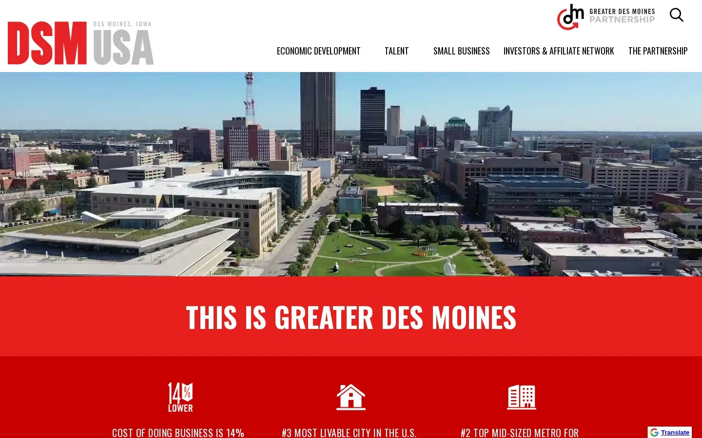
What Works
DSM Partnership is the most dominant site in this set by organic search — 9,593 monthly visits and 2,308 ranking keywords, with 430 in the top three positions. That's not an accident. The site has a genuinely deep content and data infrastructure: a cost-of-living calculator, a regional demographics section, a real estate/site search database, and an external Data Hub at datadsmusa.com. The navigation taxonomy is one of the best-organized in the category, with four distinct audience tracks (Economic Development, Talent, Small Business, Investors & Affiliate Network) each with deep sub-menus. Visually it's a 4: custom Figtree + Oswald type stack, a full-bleed hero video, an animated stat bar citing Moody's and Reader's Digest, and a coherent brand color system (DSM red + navy).
What to Steal
The stat bar. DSM surfaces third-party validation (national rankings, award citations) as a persistent element on the homepage, not buried in an About page. It signals credibility to site selectors before they've scrolled past the hero. Every EDO has awards they're not using this effectively.
What's Missing
Lead capture is the glaring gap. Despite being the most-trafficked site in this review, DSM's homepage offers a newsletter link (not an inline form) and a phone number. There are no audience-specific CTAs, no downloadable lead magnets, no "start a site selection conversation" form. An organization capturing 9,593 monthly visitors with no lead mechanism is leaving a significant pipeline opportunity on the table. One other miss: there's no dedicated site-selector front door in the top navigation — site selectors are folded into the broader Economic Development umbrella rather than given their own entry point.
#2 — EDPNC (North Carolina)
19 / 30edpnc.com · "All In North Carolina" · Built by Push10
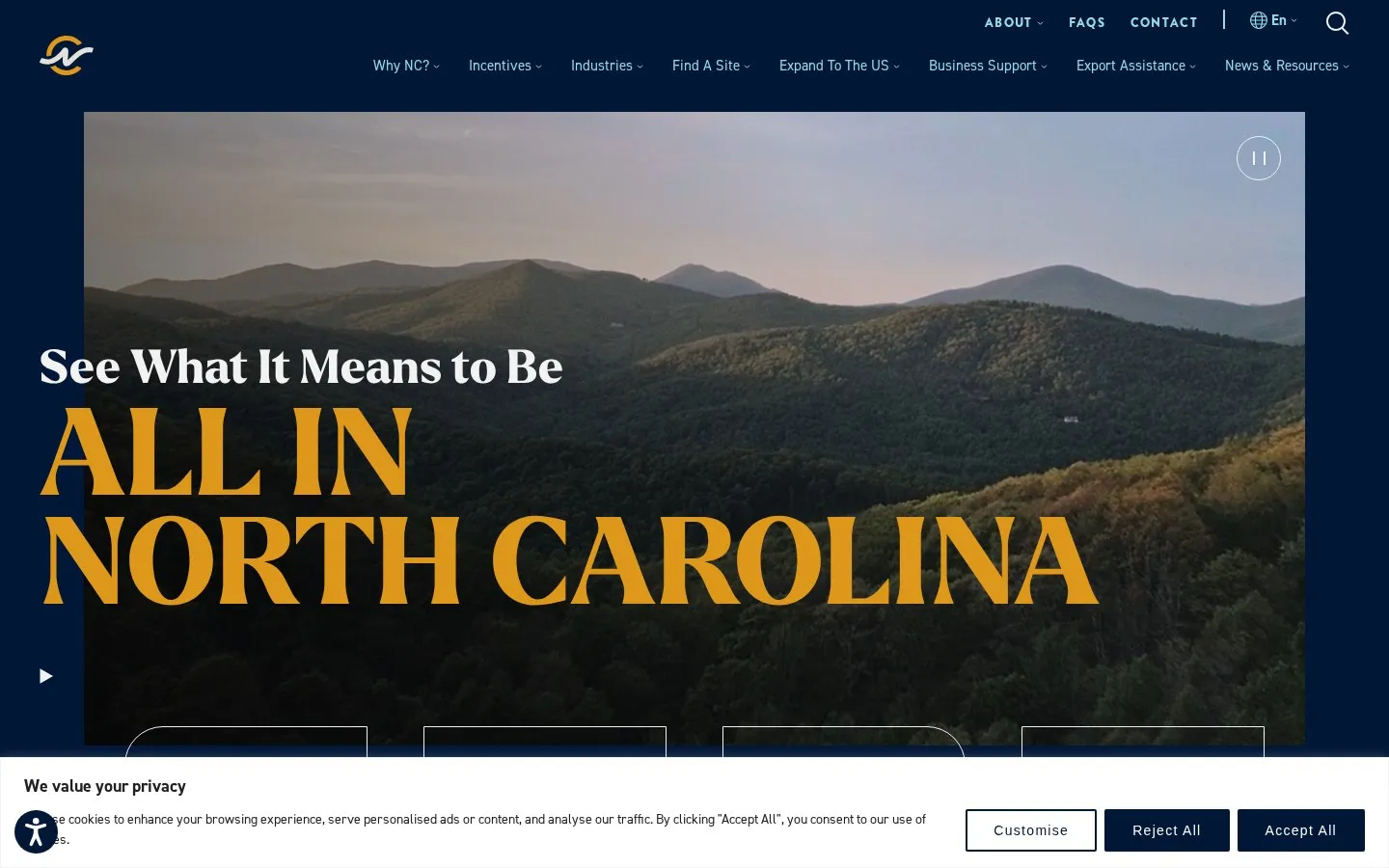
What Works
EDPNC earns the highest data tools score in this review. The homepage is anchored by an interactive state comparison map — a large SVG-based tool that lets site selectors filter and benchmark North Carolina against any other US state across workforce, costs, and business climate metrics. That's not a widget you see at most EDOs. Beyond the comparison tool, the site has a certified megasites database, NCEDAR (an interactive economic activity report), and a full site search tool. The FDI pathway is equally impressive: 11 country-specific landing pages (Canada, China, France, Germany, India, Israel, Italy, Japan, Korea, Spain, UK) give foreign companies a localized entry point. At 3,034 monthly organic visits and 702 keywords, the search presence is strong for a state EDO.
What to Steal
The state comparison tool. Letting site selectors benchmark your state/region against competitors — right on your homepage — is an extraordinarily powerful conversion mechanism. It keeps them on your site instead of sending them to a third-party comparison tool. If your region has genuine advantages in cost, workforce, or infrastructure, this kind of tool proves it interactively rather than asserting it.
What's Missing
Audience clarity at the homepage level. EDPNC has four excellent service tracks (Locate to NC, Expand to US, Business Support, Export Assistance) but the homepage doesn't surface them with persona-level clarity — there's no "Are you a site selector?" / "Expanding from abroad?" chooser. Talent attraction is also underserved: the site does everything well for site selectors and business owners but has no relocation or talent pathway for workers considering a move to NC.
#3 (tied) — InvestAtlanta
19 / 30investatlanta.com · "Equity and Prosperity for All of Atlanta"
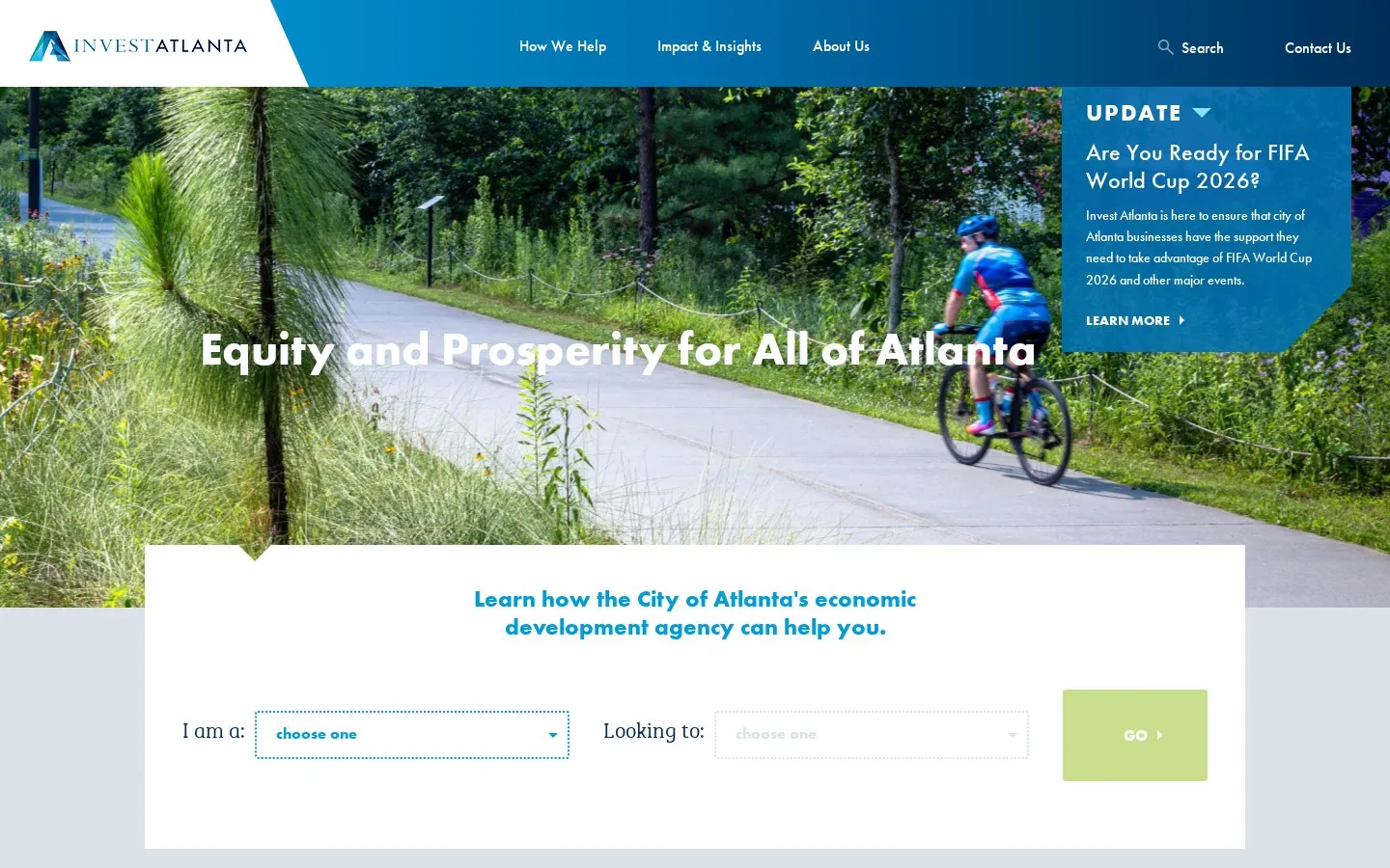
What Works
InvestAtlanta has the best audience segmentation structure in this review. The navigation is built around a tabbed mega-menu with five named audience tracks: Site Selectors, Developers, Businesses, Homebuyers & Homeowners, and Renters. Each panel has its own intro copy, a "Get Started" CTA, and tailored resources. There's also an "I am a:" / "Looking to:" routing quiz on the homepage that filters content by visitor type — something almost no EDO does. With 2,595 monthly organic visits and 698 keywords, the search presence is strong. Lead capture is above average: an Olark live chat widget, a segmented newsletter modal with 14 interest checkboxes (Business Attraction, FDI, TADs, and more), and audience-specific entry CTAs per tab.
What to Steal
The audience routing quiz. Asking "I am a: [site selector / developer / homebuyer / business owner]" at the homepage level is a low-effort, high-payoff personalization mechanism. It costs nothing to build and dramatically improves the odds that a visitor finds what they came for. The segmented newsletter modal (14 checkboxes by interest area) is also exceptional — it's the difference between a contact list and a segmented prospect database.
What's Missing
Data tools are the notable weakness. InvestAtlanta has no native interactive tools — no cost-of-living calculator, no property/site database, no incentives estimator. The closest things are outbound links to third-party GIS and startup platforms. For a public EDO targeting site selectors in one of the most competitive markets in the South, the absence of a searchable incentives calculator or site search is a meaningful gap. There's also no talent attraction pathway — the site addresses homebuyers and renters but not prospective workers or remote workers considering a move.
#3 (tied) — Say Yes to Dallas
19 / 30sayyestodallas.com · "It's More Than You Might Think" · Dallas Regional Chamber · Built by Choose Our City

What Works
Say Yes to Dallas has the strongest data tools of any site in this review. The centerpiece is an interactive cost-of-living calculator that makes DFW's affordability advantage tangible — not just stated. It's the reason the site drove 2X calculator views and 160,000 annual visitors after launch. Beyond the calculator, the site has a Coresignal-powered job board and an interactive neighborhood map. The Live / Work / Play / Thrive navigation pillars create a genuinely audience-specific experience for talent considering a move. At 793 monthly organic visits and 335 keywords, the search presence is strong for a single-market talent platform.
What to Steal
The cost-of-living calculator. This is the most powerful single feature any talent attraction website can have, and most cities still don't have one. Not a salary converter — a full cost comparison that includes housing, taxes, utilities, transportation, and childcare. The moment a talent prospect types in their current salary and sees they'd effectively earn more in your market, the conversation changes entirely. The calculator data is what becomes shareable on social media and in Slack channels. It's the thing that earns inbound links from journalists writing about affordable metros.
What's Missing
Lead capture is the biggest gap, and it's surprising given how much effort went into the tools. There is no email newsletter, no gated relocation guide, no "stay connected" mechanism of any kind. The Relocation Guide is a linked page — not a downloadable PDF requiring an email. The site runs retargeting pixels (TikTok, Meta), which means someone is thinking about re-engaging visitors — but passive pixel retargeting is not a substitute for actually building an email list of warm prospects. Adding a simple "Get the Dallas Insider Newsletter" signup would transform an already-strong site into a genuine demand-gen engine.
#3 (tied) — West Slope Local
19 / 30westslopelocal.com · "Life is better on the Western Slope" · Grand Junction, CO · Built by Choose Our City
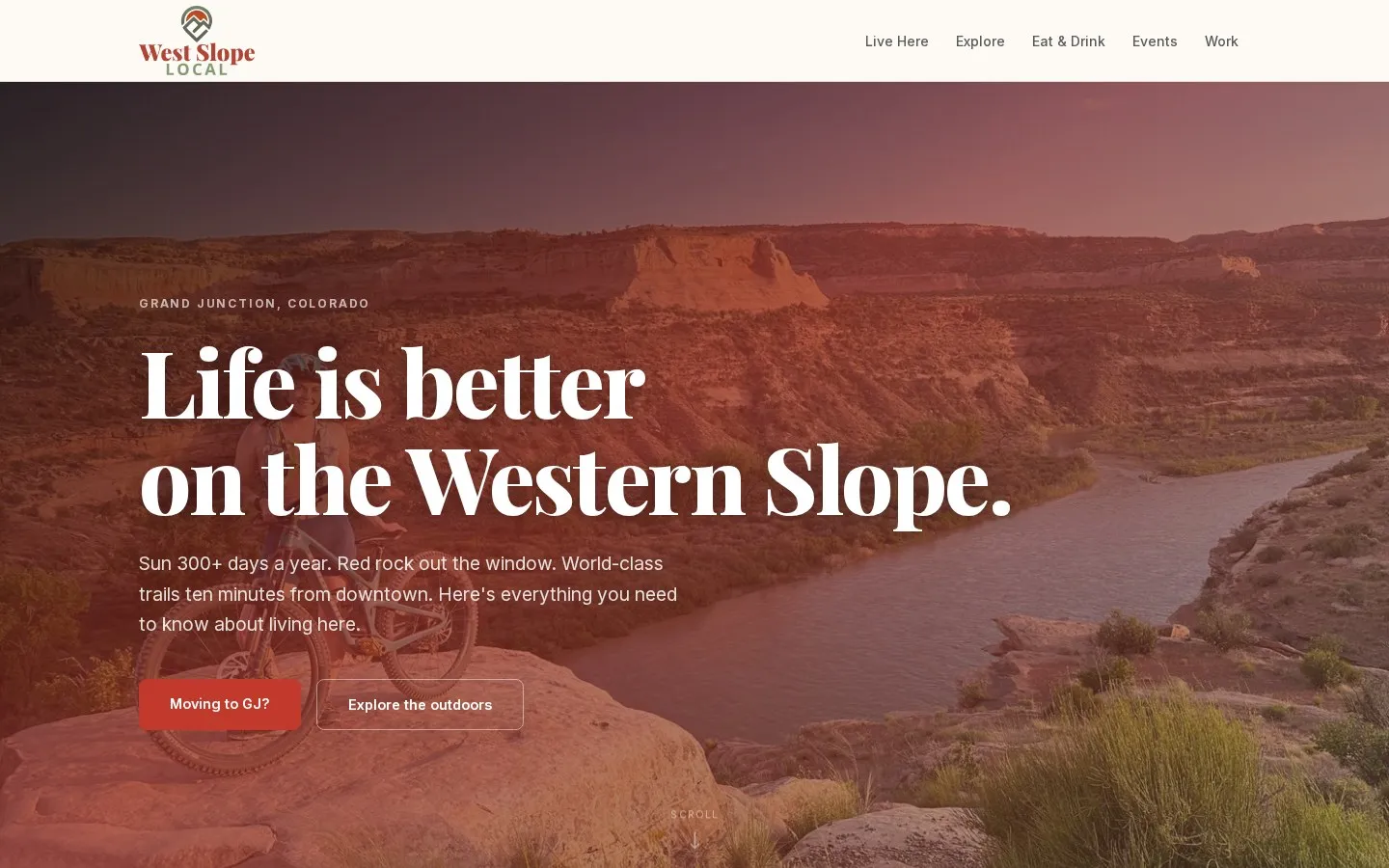
What Works
West Slope Local is the best-designed site in this review. It earns the only 5/5 design score because it does something no other site here manages: it reads like a real person wrote it. "This site is my attempt to document all of it honestly, the way a neighbor would." That voice — combined with Playfair Display editorial headlines, a mountain biking hero image, a genuine author photo, and zero filler copy — creates an experience that feels lived-in rather than produced. Built on Astro (static HTML, no JavaScript by default), it loads at near-instant speeds. The tool suite is also strong: cost-of-living calculator, interactive neighborhood map, relocation guide, job market overview, outdoor recreation guides.
What to Steal
Lead with lifestyle, not logistics. Every other site in this review leads with economic statistics, organizational descriptions, or business-attraction messaging. West Slope Local leads with a mountain biking photo and "Life is better on the Western Slope." That's the voice talent actually wants to hear. The lesson isn't to be informal — it's to put yourself in the shoes of a remote worker in Austin who's considering a move. What do they actually want to know first?
What's Missing
Search visibility is a 1/5 — but that's a function of age, not architecture. The site launched in early 2026 and has essentially zero organic traffic yet. That will change as the content matures and builds topical authority. Lead capture is also an honest 2/5: no email signup, no forms, no newsletter. For a talent attraction site, capturing the email of someone who visited the relocation guide is extremely valuable — that's a warm prospect who self-identified as considering a move. It's the next thing this site needs.
#7 — Indiana Economic Development Corporation
18 / 30iedc.in.gov · "Indiana is calling you"
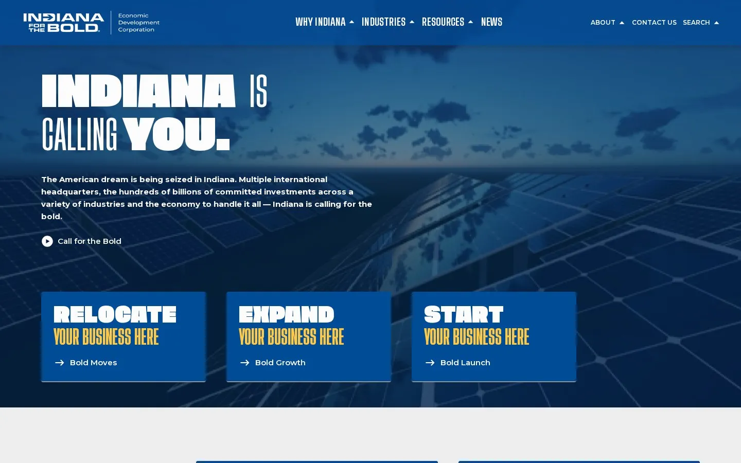
What Works
IEDC Indiana hits the middle of this review with competent, professional execution across the board — no category below 3, nothing exceptional above 4. The custom Tusker Pro variable font gives the site a distinctive typographic identity, and the hero copy ("Indiana is calling you." / "Call for the Bold") is sharper than most state EDO messaging. Hero cards segment by action (Relocate / Expand / Start Your Business Here), and the nav has dedicated pathways for site selectors through the IEDC Property Systems and ZoomProspector integrations. HubSpot newsletter capture is embedded in every dropdown nav panel, which is above-average coverage. A Workforce Data Center with sectoral stats rounds out the data offering.
What to Steal
Newsletter capture embedded in every nav dropdown. IEDC's HubSpot form appears in multiple nav sub-menus — not just the footer. That placement means the capture opportunity surfaces to users who are actively navigating the site looking for something specific. It's a small architectural choice that significantly increases the odds of conversion versus a single footer signup.
What's Missing
Property search routes to ZoomProspector (a third-party redirect) rather than an owned tool — this breaks the on-site experience at the most critical site-selector moment. The video modal also contains "Lorem ipsum" placeholder text, a production quality miss that's been live on the site. Talent attraction exists as a data resource for businesses but there's no Life in Indiana pathway for prospective workers themselves.
#8 (tied) — World Business Chicago
15 / 30worldbusinesschicago.com · "Fueling Chicagoland's Competitive Economy" · Built by Clique Studios
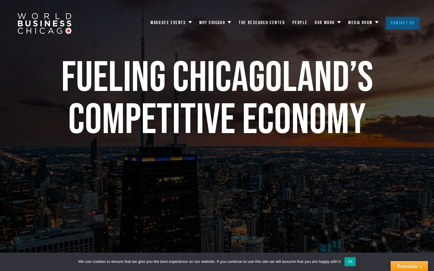
What Works
WBC is a well-designed site built by a respected Chicago agency (Clique Studios) — autoplay hero video, scrolling partner logo ticker, animated statistics, clean industry card grid. The design is modern and the production quality is high. Chicago 2050, a long-term economic development plan, gets prominent feature placement. At 1,463 monthly organic visits the search presence is functional if underperforming for an organization of WBC's stature.
What's Missing — and What Other EDOs Can Learn From
WBC illustrates a failure mode common among well-resourced EDOs: investing heavily in design while neglecting audience architecture. The homepage presents exactly the same experience to a corporate site selector, a foreign investor, a Chicago resident, and a job seeker — there is no audience fork, no routing mechanism, no tailored entry point for any of these very different visitors. The Economic Dashboard — their most compelling data asset — is delivered as a static PDF download rather than an interactive tool. Lead capture is minimal: one "Contact Us" button in the header. ActiveCampaign is running in the backend, suggesting a sophisticated email program exists, but none of it is connected to the homepage experience where anonymous traffic actually lands. This is a recurring pattern: organizations with mature internal marketing programs whose websites don't reflect that sophistication to the outside world.
#8 (tied) — Broken Arrow Economic Development Corporation
15 / 30brokenarrowedc.com · "Where business grows, the community thrives" · Broken Arrow, OK
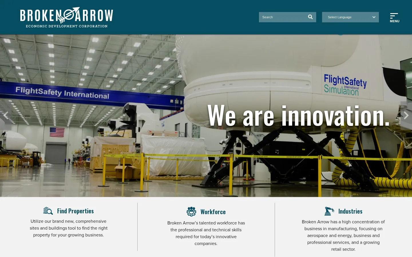
Why This Site is Here
Broken Arrow EDC represents something most "best websites" roundups avoid: a typical small-market EDO that's doing a reasonable job. It's here because it's honest. Most EDOs are not DSM Partnership or InvestAtlanta — they're a small team with a limited budget trying to serve site selectors, businesses, and talent with a WordPress site they update when they can. Broken Arrow earns its spot because it does something larger organizations often fail to do: its WP-Property sites and buildings database is genuinely impressive for its market size, with filterable attributes including crane availability, rail access, and ceiling height. A 2024 Workforce Needs Study is linked. An "Amplify BA" investor program has real structure. The recent Amazon same-day distribution center win (March 2026) is prominently featured. This is a site doing the right things with limited resources.
What to Steal
The property database. A searchable sites and buildings tool with crane specs, rail access, and utility details is the number one thing site selectors actually need from a local EDO site — and Broken Arrow has it despite being a city of 115,000 in northeastern Oklahoma. If they have it, your community has no excuse not to. There are several good WP-Property and CoStar-integrated solutions that don't require a six-figure custom build.
What's Missing
Lead capture and organic search are the limiting factors here. The site has 122 monthly organic visits — almost no one is finding it through search. There's no downloadable community profile, no email capture, no "confidential project inquiry" form on the homepage. For a site whose primary audience is site selectors who move quickly and confidentially, the friction to initiate contact is too high. A gated community profile PDF would be both a lead magnet and a useful deliverable — it's the first thing site selectors want anyway.
#10 — Team Texas
14 / 30goteamtexas.com · "Big. Bold. Texas."
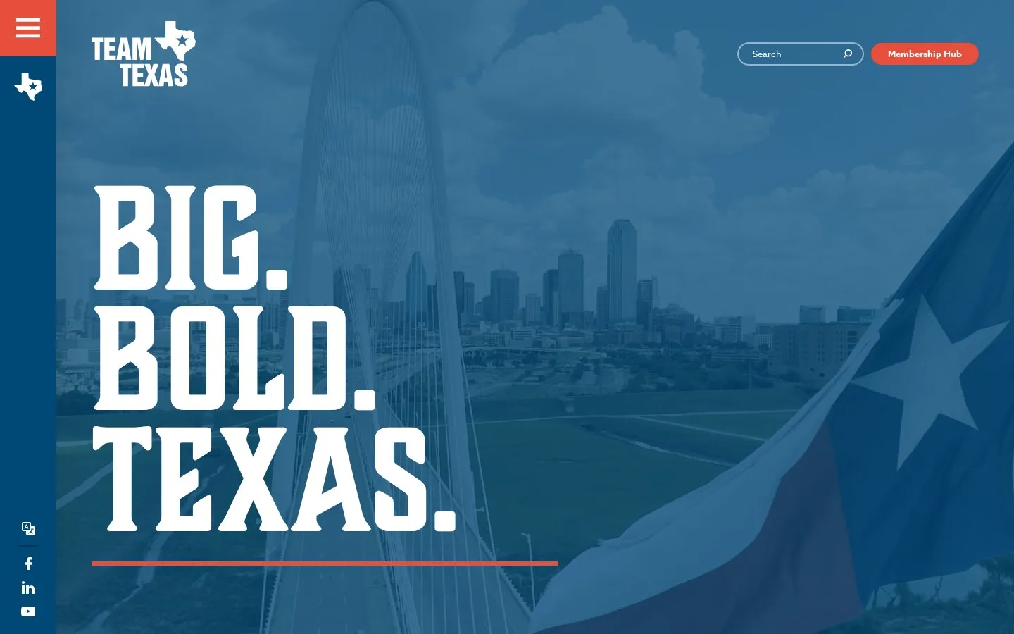
The Cautionary Tale
Team Texas illustrates a trap that catches a lot of well-funded EDO initiatives: spending on production quality while underinvesting in substance. The site is genuinely good-looking — Tailwind-built, video hero, custom SVG TEAM TEXAS identity, WebP images, swiper-powered stats carousel. The "Big. Bold. Texas." headline is legitimately strong. And yet at 65 monthly organic visits and 12/25 on the rubric, it's the lowest-scoring site in this review.
The problems are structural. There is no audience pathway for talent — individuals considering a move to Texas see the same page as corporate site selectors evaluating a manufacturing expansion. There are no interactive data tools: no cost calculator, no property database, no incentives estimator. The "Interactive Map" in the nav shows member organizations, not available sites or community data. The lead capture newsletter form in the footer appears to have a broken submit button (not visible in the source code). The "Member Projects & Wins" news feed features announcements from 2020, suggesting the site isn't actively maintained.
The Lesson
A state-level EDO coalition with Texas's economic story behind it should be one of the strongest sites in the country. The fact that it scores below a small-market Oklahoma EDO in data tools and lead capture tells you something important: design execution is the easiest problem to solve, and most organizations solve it first. Strategy — who is this site for, what do they need, how do we capture their interest — is what actually determines whether the site does its job.
What the Scorecard Reveals
After scoring nine sites across six criteria, a few patterns are impossible to miss.
Eight of nine sites in this review scored 3 or below on lead capture. The best-trafficked site (DSM Partnership, 9,593 monthly visits) scored 2/5 on lead capture. This is the single biggest gap in EDO digital strategy: organizations spending tens of thousands of dollars driving traffic to their sites, then offering nothing to convert anonymous visitors into known prospects. The fix doesn't require a redesign — it requires adding an inline form, a gated download, and a clear CTA per audience.
Seven of nine sites scored 4/5 on design. Good design is now the baseline, not a differentiator. Any competent agency can produce a professional-looking EDO website. What separates the top-scoring sites from the bottom isn't how they look — it's what they do for their audiences. Audience clarity, data tools, and lead capture are where the real competitive gaps exist.
Even well-designed multi-audience sites (DSM, IEDC, World Business Chicago) bury their talent content or serve it as a B2B data resource for employers rather than a relocation pathway for individuals. The two sites built specifically for talent (Say Yes to Dallas, West Slope Local) are the only ones with a cost-of-living calculator and genuine lifestyle content. For most communities, talent attraction digital strategy is an open field with almost no competition — and huge leverage.
Not one of the nine sites in this review scored 4 or 5 on mobile PageSpeed. The average across the set is 50 — right at the boundary Google considers "poor." EDPNC's score of 28 is directly caused by the state comparison SVG tool that makes them best-in-class on data tools. That tradeoff is real and worth naming: interactive tools add load time, and most EDOs don't have dedicated engineering resources to optimize both simultaneously. The Astro-built West Slope Local (68) is the best in the set — and it's not close. Read more about how page speed affects site selector impressions and what to do about it.
DSM Partnership is the clear organic search leader (9,593 monthly visits), but it's exceptional. Most sites in this review are capturing a fraction of what their budgets should be able to achieve in organic visibility. The keyword landscape for EDO-specific queries is remarkably uncompetitive — there's no reason a well-built EDO site with consistent content output can't rank for the search terms its target audiences use. See our EDO SEO services for what this looks like in practice.
Score Your Own Site
Use the six-criteria rubric from this post to score your site out of 30 — or fill out the form and we'll run it for you and send a straight read on where you stand.
Frequently Asked Questions
How Does Your Site Score?
We offer a free 15-minute digital presence review for EDOs, chambers, and community organizations. We'll run your site through the rubric, pull your GSC and Ahrefs data, and give you a straight read on where you stand — and what to prioritize.
Book a Free Site Review →